Tuesday, August 22, 2006
New Look
Well, after 2 years with basically the same look, I pulled the site down and changed it around. I'm going for a cleaner more streamlined look. It is still a work in progress. If any of you charming readers happen to be good at HTML and would care to look at my code and tell me how to fix some of the little buggy things that are still on here - you would be my hero forever. There is also more content on the way, especially for the bar on the right. If you have any suggestions for what might be good there, I'd love you hear from you on that too. Anyhow, I hope you like the new look.
Subscribe to:
Post Comments (Atom)


4 comments:
I think your best option for the picture is just to resize it, otherwise, you'll probably have to redo a lot of other things.
Microsoft has a powertool: Look for image resizer which makes things easy to resize by just right clicking on the picture file.
I'm not sure about the blips on the far right, they seem to be part of the background, the logo at the top might be too big for the box you have designated, but that's only a guess; unless you intended the border to go all the way around the entire blog.
I like that change though, it looks good.
Nice ear, mate.
nice ear/lamp/trinity dorm room
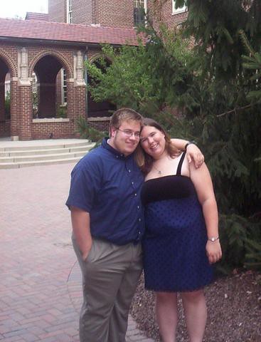
Ok "friends" I think I've got the profile photo problem fixed. Now lay off would ya?
Post a Comment